Beyond blanding: The next big things you'll see in direct-to-consumer brand design
Three designers look into their crystal balls to predict the next big thing in direct-to-consumer brand aesthetics.
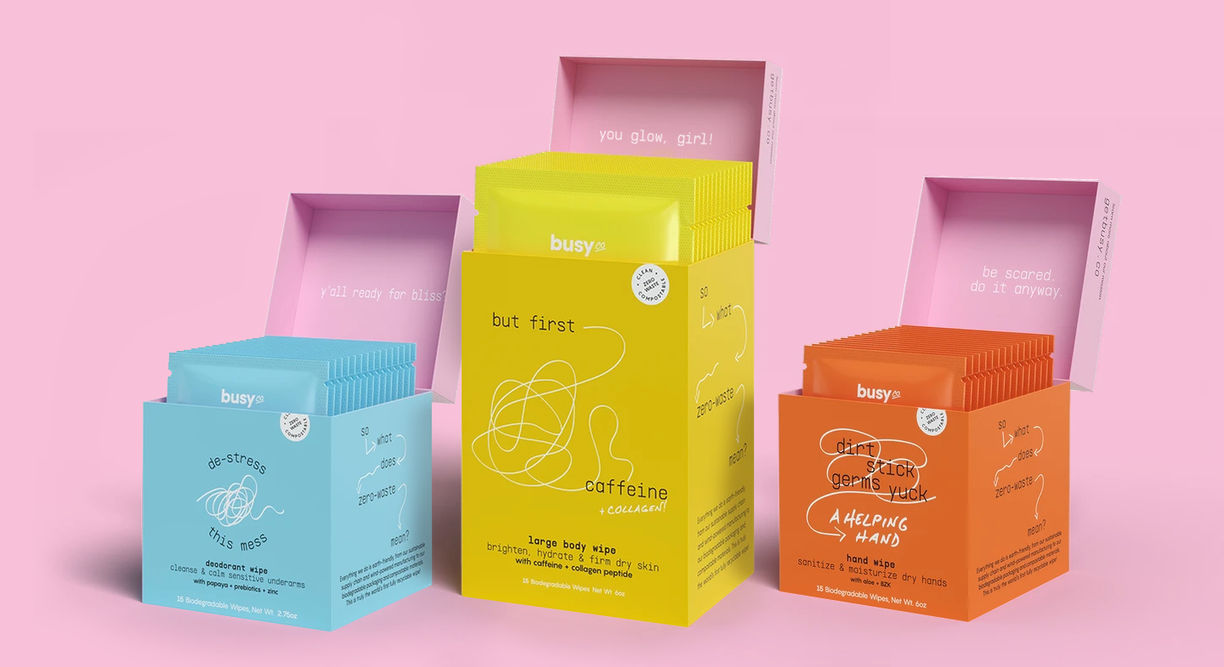
The packaging for Busy Co, a zero-waste wipes company, designed by SMAKK Studios. (Photo: SMAKK Studios)
TREND DIVE
Skinny fonts on neutral backdrops, products photographed on pastel backgrounds, and type on a curved path – these are among the brand aesthetics that designers told Thingtesting they are fed up with seeing.
“There are trends that get done to death,” says Dari Israelstam, the founder and creative director of Universal Favourite, an Australian design studio that has worked with the likes of U.S. Gen Z beauty brand Youthforia, Aussie virtual wine club Good Pair Days and contact lens brand Dimple. “It’s partly a reflection of what the market wants, and what consumers are buying. But I would love to see a bit more brand personality in the product photography, and I’m not sad to see the ‘blanding’ trend go.”
In the world of direct-to-consumer brands, new trends in design aesthetics tend to take on a life of their own. This phenomenon is, in part, a result of how long it can take to complete a branding job – in the months that an agency spends working with a young company to get its packaging pitch perfect, it’s likely that multiple other brands, agencies and designers will have picked up on the same ideas. The result, to the eye of the untrained consumer, is an apparent flood of copycat brands emerging all at once, each mimicking the others’ typeface, color palette, or photography style.
Sometimes, it’s the brands themselves that are the culprits, approaching agencies to see if they can replicate the success their competitors or peers are having with a certain look.
But if not “blanding,” the term (which designers are also sick of) used to describe the minimalist same-ification that has emerged among modern brands, then what? We asked three creative directors to give us their predictions.
“Corporate with a wink”
Despite being a recent-ish fad, the “Gen Z aesthetic” – with its bright and bold colors, and made-for-Tiktok goofiness – is already an established facet of the direct-to-consumer visual lexicon. What’s interesting now, Katie Klencheski, the founder of SMAKK Studios, which has worked with feminine care brand The Honey Pot, Busy Co, and toothpaste company Risewell, says is to see how it develops.
“I’m really happy that we’re in this maximalism phase, because I think that this is where we start to see a lot of ideas getting iterated on very quickly,” she says. “Of course there’s a ton of these copycat brands doing chubby logos and 90's web references, but it does feel like this creative explosion after a lot of restraint.”
Klencheski says brands targeting younger consumers are now taking visual cues from previous decades, but adding their own irreverent, tongue-in-cheek twists. It’s something that can be seen in sunscreen brand Vacation, which has gone heavy on the pre-2000s advertising references, or Moody Incense, an Australian incense brand that uses models sporting 70s-style jumpsuits and thick mustaches, who act out the mood of each of the brand’s fragrances.
“[This] audience is more fluid when it comes to aesthetics – everything doesn’t need to be all neat and perfect. There’s a little more honesty, play and experimentation,” Israelstam adds, noting that there is “a lot of vintage referencing going back to the 90's and 2000's.”
Klencheski says this style of over-the-top branding could almost be considered a rejection of consumerism – and is a reflection of the moment in time in which Gen Zers are growing up. Unlike millennials who spurred the “homebody economy,” putting faith in luxe pajamas and on-demand courier apps to help soothe their anxiety, Gen Zers are more skeptical of what it is that brands can actually do for them, putting pressure on those companies to get their values across. According to one 2019 survey, those born after 1995 are three times as likely to say that a brand should “serve communities and society” compared to the general population.
Strange and surreal
Other brands are experimenting with even greater detachment from the world of direct-to-consumer brands, dealing in alternate realities, dreamscapes, and surrealism.
Examples of this otherworldly aesthetic can be seen in the visuals that accompany drinks brands Kin Euphorics and Recess’s social media feeds, which feature anthropomorphized drinks cans that are getting dressed up for a night out, or landing on earth from outer space. Their purpose is to provide a shorthand to explain how ingredients like ashwagandha or CBD might make the consumer feel.
Claire Olshan, the founder of snack brand DADA Daily, meanwhile, was recently dubbed the “Martha Stewart of surrealism” by Snaxshot, a food-and-drink trend forecasting newsletter.
“A lot of brands are talking about how their products make you feel, [and] those benefits are actually really difficult to articulate,” explains Klencheski, adding that she herself has been “dipping back to early Dadaist work as a point of inspiration.”
This trend no doubt stems from the wellness industry’s sprawling takeover, with products in every category imaginable now being sold with a self-care benefit. Now that the likes of Magic Mind and Moon Juice have helped to push adaptogens and nootropics firmly into the mainstream, it’s likely that brands will continue to look for more visual inspiration from the novel ingredients they are selling to comfort-seeking consumers, as has happened with the increasing legalization of cannabis across the U.S.
Magic mushrooms are now thought to be on the same path. Throughout 2020, psychedelic themes had already been becoming increasingly present in the world of fashion. According to fashion forecasting company Heuritech, sales of tie-dye print apparel are expected to rise 6% this winter.
Minimalism 2.0
The maximalist brand experimentation has just begun – but that doesn’t mean minimalism is entirely on its way out, the creatives Thingtesting spoke to say.
“After this color explosion, I wonder if we’ll go back to appreciating black-and-white, or using color as a surprise, rather than a blunt hammer we’re hitting people with,” Klencheski says.
Adey Efrem, the founder of consumer goods branding agency Swoon Studios, predicts that direct-to-consumer brands may now be seeking to take simplicity and minimalism to a new level, where brand identities are distilled right down to single colors, or even single letters from a logo. “That can be the centerpiece for the whole design, and larger than any other element on the packaging,” she says. “Sometimes it won’t be the logo – they’ll chose a single color. It’s a challenge for designers to simplify a brand’s look [like that].”
Brands like London honey company B’s Bees, where a chunky, bold letter B is repeated across is packaging, are already channeling this vibe, which Israelstam describes as minimalism “with personality.” Hard seltzer brand Gerry’s and Canadian ice cream brand Swirl, meanwhile, have opted for packaging that features nothing but the brand’s logo, plus any bare minimum details required.
Efrem says minimalism will always have a place in a world that’s as noisy and busy as the one that we live in today – particularly as we continue to emerge from the pandemic. “The simplicity we’re going towards now, I think, is directly related to the fact we all feel some level of anxiety and stress in our lives,” she says. “It’s human to have these two extremes. Sometimes you just need complete peace and quiet, and sometimes you have so much energy that you need to get out.”
What is Thingtesting?
Thingtesting is a database of internet-born brands. We’re building the un-sponsored corner of the internet where consumers can come together to talk honestly about new things. Read more about Thingtesting.
Create a free account to access exclusive features on Thingtesting and receive our weekly newsletter.
Feedback? Yes, please.